


2023 spring and summer popular color home matching strategy
Today,we will share with you the use and matching of these colors. Just take a small book and write it down as soon as you see which color you like.

Mint green can be said to be my favorite color among these five colors. It is said that it will also occupy the C position in 2020 and become the dominant popular color. And such summer colors are very pleasing to the eye.
More fresh and summer mint green, whether it is used on a large area, such as walls, tiles, etc., is a very distinctive color; while small areas of embellishment and the use of single items can change the overall atmosphere and bring nature Refreshing feeling.
The mint green wall color can be matched with red and yellow tones to form a contrast, but also more matte and fresh; it can also appear in the bathroom, the use of tiles will be more retro.
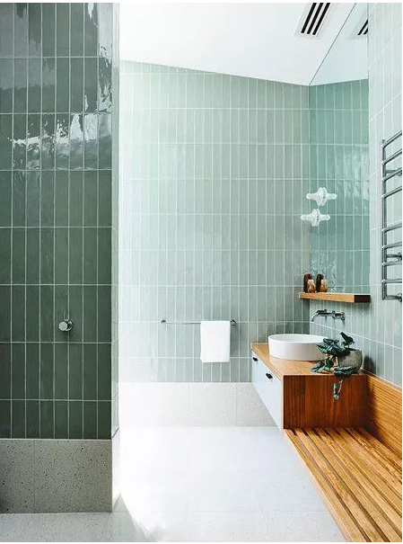
You can consider this color when choosing lamps and soft furnishings. Matching with gray, beige, and white, it will not be abrupt and can also make the space more dynamic.

Matching case
You can see what kind of visual effect and atmosphere this fresh color brings to the space.
01 SUMIYOSHIDO


02 The Budapest Café

Director Wes Anderson’s unique visual style provided inspiration for the Budapest Café located in Chengdu, China. The Biasol design team from Melbourne found a balance of colors in different materials, stacking layers to create a multi-layered visual experience, green and The perfect collision of pink and different shades of green also bring a sense of hierarchy and surprise to the space.

Single product recommendation:

IKEA


The pink melon orange, with a hint of warm orange on the basis of pink, is just perfect sweetness, and the indoor use of this color will give people a brighter feeling.

The large-scale use of melon orange will make people feel like living in the candy, and it also has a warm taste. For girls who like pink and want more advanced textures, you might as well try this color.


The combination of orange and wood material will be more warm, and in the selection of single products, you can slightly choose medium-sized sofas, tables, etc.

Case match
01 Spotti Milano space
Product designer and artist Elena Salmistraro was invited to design a display area for Spotti Milano and exhibited the latest products of the furniture brand Vitra 2019, which is also part of the 2019 Milan Design Week. With a brain like a genius, she uses the most pioneering colors to create a dream place.


02 Three Birds Workspace
The design studio Three Bird is located in Sydney, Australia. In order to highlight the concept of "warmth, friendliness and cooperation", the space specially selected warm matte tones to create an inspiring work environment.


 Single product recommendation


「Mellow Yellow 」
Unlike the lemon yellow color that was popular in previous years, the yellow color in 2020 will develop in a deeper direction, with its own nostalgic filter. In recent years, nostalgic and warm colors have been loved by the public.

Yellow is best used locally, although there are also large-scale use cases, but the effect of embellishment is more prominent.
Large area use
Large-scale use is actually very bold, and the use of wall color is the most common, which can bring a warm atmosphere. If you really want to use this color on the wall, we recommend the use of color separation and splicing, which will be more creative.
 Local embellishment
The yellow partial embellishment makes the space brighter, such as the filling of door frames and window frames, and the choice of sofas. It is recommended to match a velvet sofa to highlight the warmth of the color. Matching with pink is also a good choice.


If you like the above colors! The next case will give you a super surprise and visual enjoyment!
Colorist-Banana Flat
This house is located in Belarus and has an area of 103.5 square meters. Inhabited by a couple and two children, the open space and colorful furniture make the whole house full of surprise and vitality.


Through the collision of fresh colors and the integration of indoor geometric lines, the whole house is full of modern design. In the bathroom, three bright colors are combined, which makes people have to admire the designer's skill.

The children's room is also exquisite and lovely, and the clever changes in the walls are the finishing touch.

The above is all the content of today. The analysis of popular colors in this issue will give you inspiration and reference when matching. Fashion changes every year, but the home will not change. You can recreate and match small parts. Home injects more fresh vitality.
Happy reading! You can tell me what color you like and what color inspiration and matching case you want to see.


